Project
Freecharge Icons

Client:
Freecharge
Date:
Jul 3, 2017
Category:
Interaction desing, Iconography
Freecharge home page experience: Creating a unified Iconography
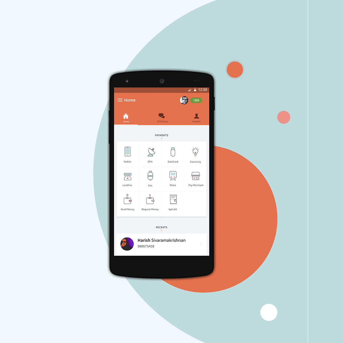
Transforming the Freecharge home page, we embarked on a mission to establish a cohesive and unified iconography system. Through meticulous design decisions, we aimed to enhance the overall user experience by creating intuitive and visually harmonious icons across the platform.
Approach:
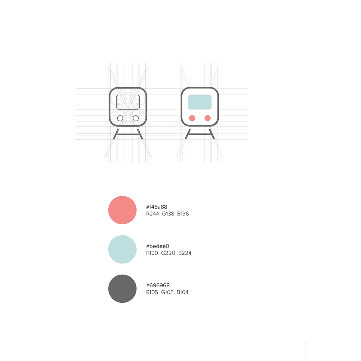
The icons are well characterized by the nature of their appearance, considering the subtle application of colors and the degree of roundness applied to the strokes. Complementary colors provide a neutral appearance to the icons, aiding observers in distinguishing and identifying patterns easily. All the icons follow an indexical way of communication, which is crucial for a platform like Freecharge that stands for simplicity.
My Role :
Icon Design:
I initiated the design process by comprehending all the constraints, including minimum size, color contrasts, and overall interface aesthetics. Considering these factors, I identified a grid system capable of accommodating the necessary details for each icon. Subsequently, I began iterating through different design directions.
Expanding the design language:
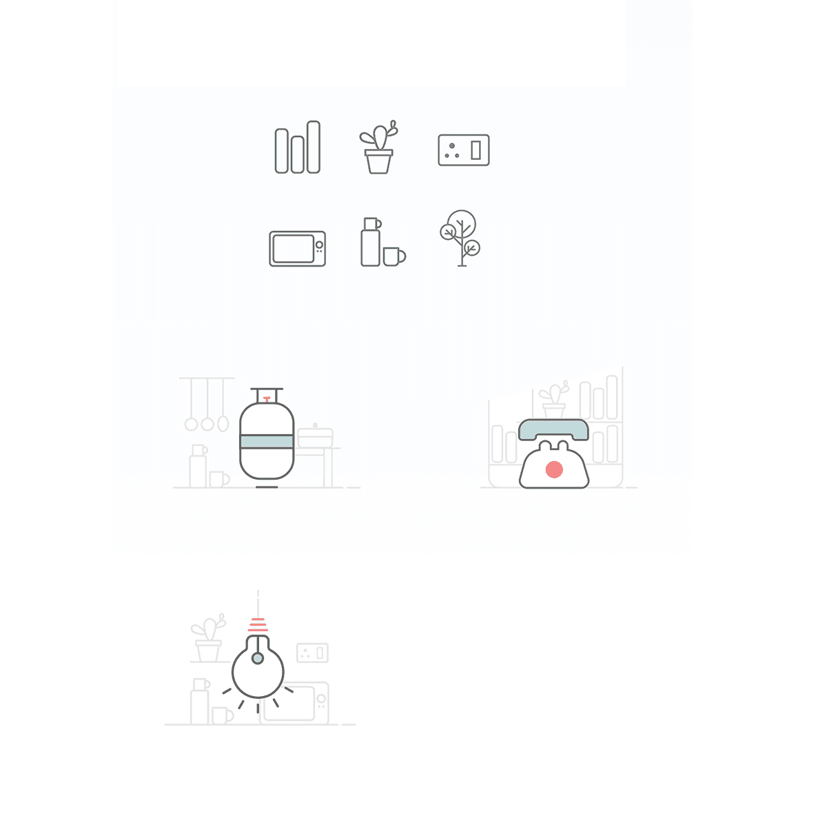
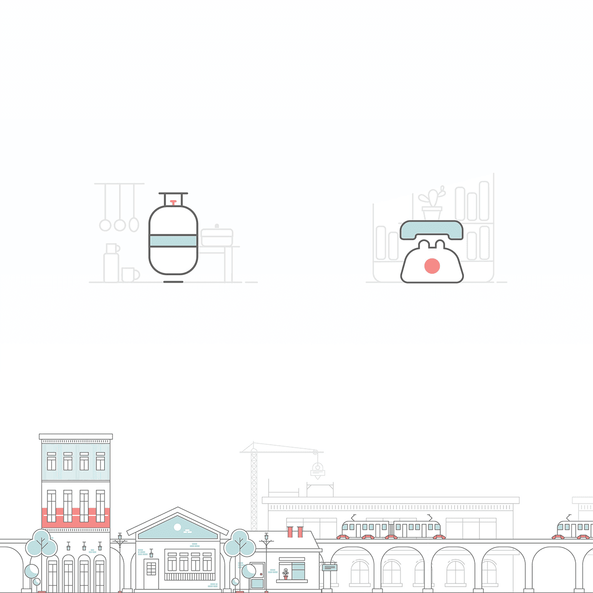
Despite its initial simplicity, the exploration of design directions for the brand proved impactful, particularly in the context of iconography. Recognizing this impact, we extended the design language to encompass all other brand elements. During the icon design phase, I strategically considered the expansion of this style into mini illustrations, incorporating secondary elements that proved valuable as we applied this style to other brand components.
Testing and Implementing:
After finalizing the design direction, I collaborated closely with product designers and developers to test the design, making necessary refinements before implementation.
Solution:
The solution to the Freecharge icon project involved understanding constraints, identifying a versatile grid system, and iterating through various design directions. Expanding the successful iconography style to other brand elements, such as mini illustrations, was crucial for a unified and visually appealing interface. Collaborating with product designers and developers allowed for thorough testing and refinements before the final implementation, ensuring a cohesive and effective visual language for the brand.
The Freecharge iconography design aimed to create a unified and visually appealing iconography style, considering constraints, implementing a versatile grid system, and expanding the design direction to other brand elements for a cohesive and effective interface.

Client:
Freecharge
Date:
Jul 3, 2017
Category:
Interaction desing, Iconography
Freecharge home page experience: Creating a unified Iconography
Transforming the Freecharge home page, we embarked on a mission to establish a cohesive and unified iconography system. Through meticulous design decisions, we aimed to enhance the overall user experience by creating intuitive and visually harmonious icons across the platform.
Approach:
The icons are well characterized by the nature of their appearance, considering the subtle application of colors and the degree of roundness applied to the strokes. Complementary colors provide a neutral appearance to the icons, aiding observers in distinguishing and identifying patterns easily. All the icons follow an indexical way of communication, which is crucial for a platform like Freecharge that stands for simplicity.
My Role :
Icon Design:
I initiated the design process by comprehending all the constraints, including minimum size, color contrasts, and overall interface aesthetics. Considering these factors, I identified a grid system capable of accommodating the necessary details for each icon. Subsequently, I began iterating through different design directions.
Expanding the design language:
Despite its initial simplicity, the exploration of design directions for the brand proved impactful, particularly in the context of iconography. Recognizing this impact, we extended the design language to encompass all other brand elements. During the icon design phase, I strategically considered the expansion of this style into mini illustrations, incorporating secondary elements that proved valuable as we applied this style to other brand components.
Testing and Implementing:
After finalizing the design direction, I collaborated closely with product designers and developers to test the design, making necessary refinements before implementation.
Solution:
The solution to the Freecharge icon project involved understanding constraints, identifying a versatile grid system, and iterating through various design directions. Expanding the successful iconography style to other brand elements, such as mini illustrations, was crucial for a unified and visually appealing interface. Collaborating with product designers and developers allowed for thorough testing and refinements before the final implementation, ensuring a cohesive and effective visual language for the brand.
The Freecharge iconography design aimed to create a unified and visually appealing iconography style, considering constraints, implementing a versatile grid system, and expanding the design direction to other brand elements for a cohesive and effective interface.