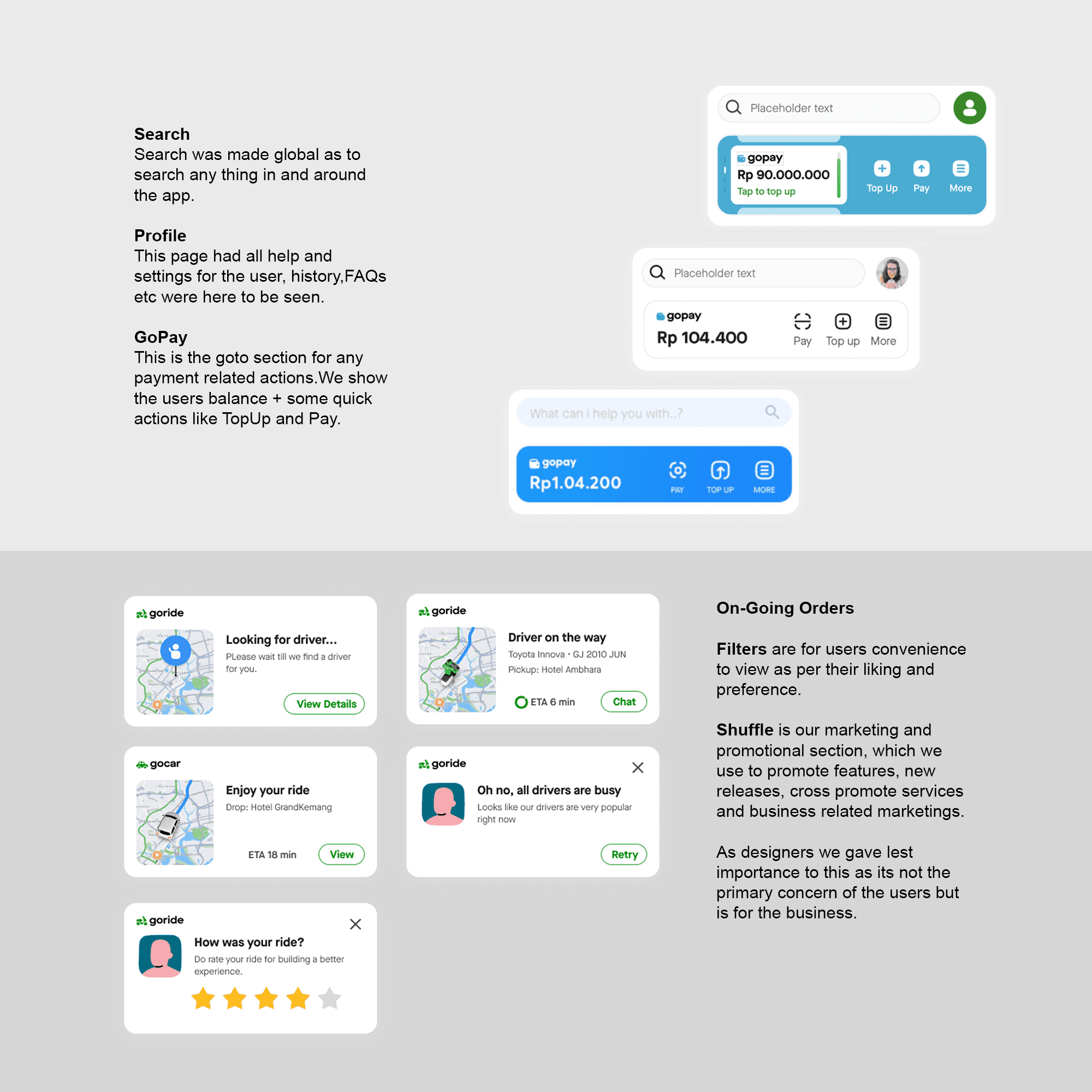
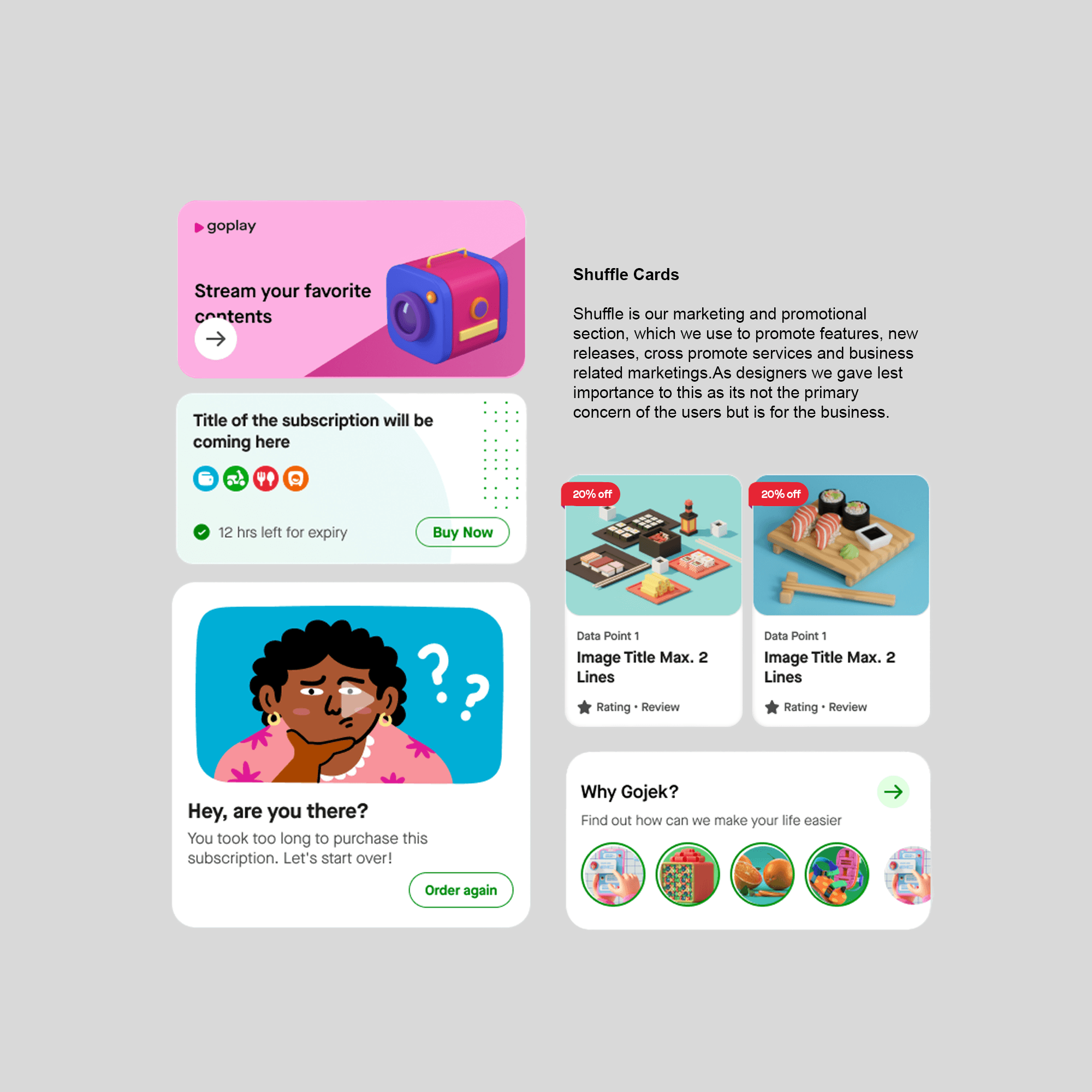
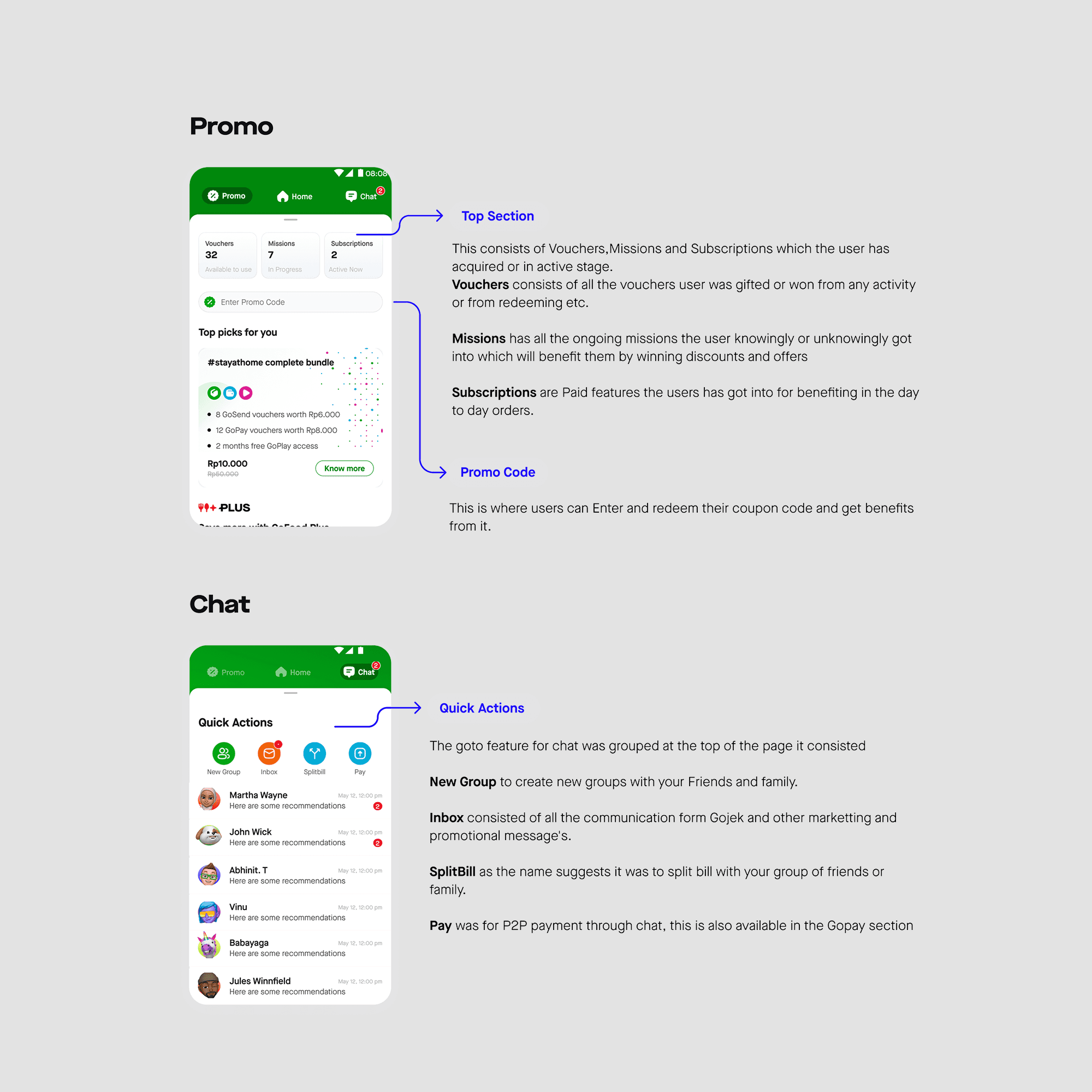
Project
Gojek Home 4.0
Client:
Gojek
Date:
Jan 24, 2020
Category:
Product Design
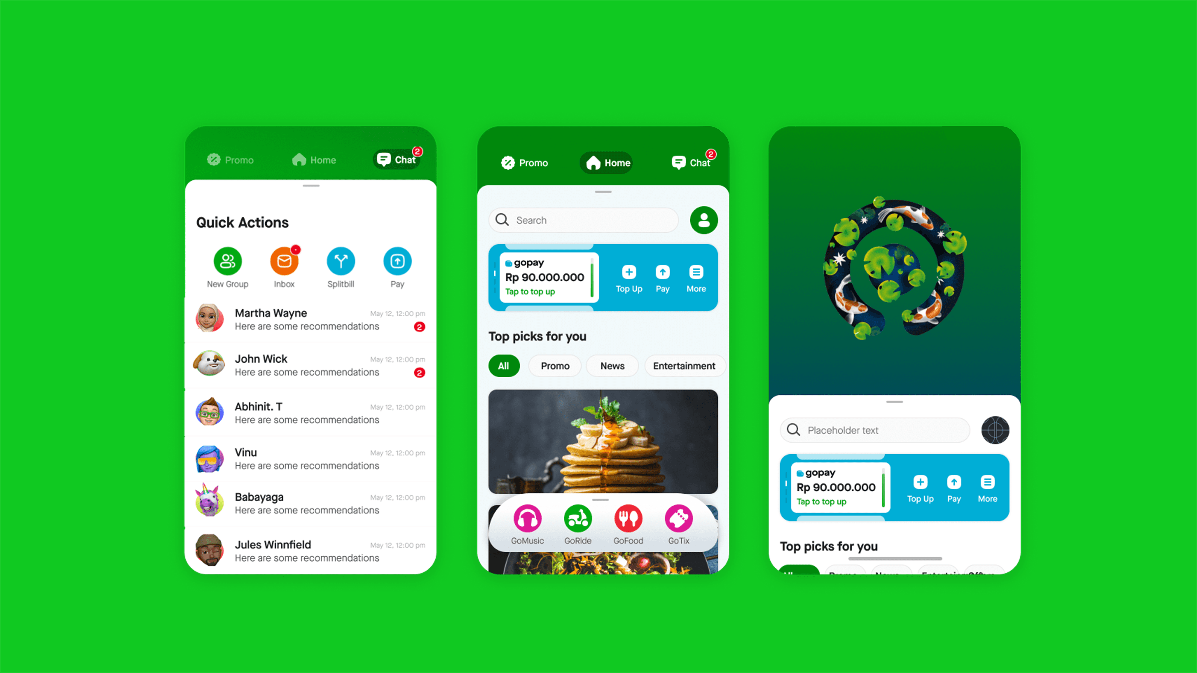
New Experience to Gojek Home : Making it delightful
Home Screen 4.0 is the landing page on Gojek from where the users journey initiates for all the products and features. We had a company goal from the top leadership to assure delightfulness to the users, which is a great opportunity for designers to show empathy on our users and we left no stones to fulfil the same. This screen as mentioned is start to all the primary flows to the gojek ecosystem and we had got the opportunity to redesign it with the up coming rebrand and launch of our design systems.
My Role and Process
My responsibility as a Lead Principle Designer for this project was to discover a new user experience that allows users to navigate the home section using simple gestures with just their thumb.
Also Incorporating the new design language, Branding and contribute to the new design system being created.
Involved teams from diffrent functions
Launching parallel in countries like Singapore, Vietnam and Thailand with the new design.
8 weeks brainstorming and discussing requirements of the respective functions
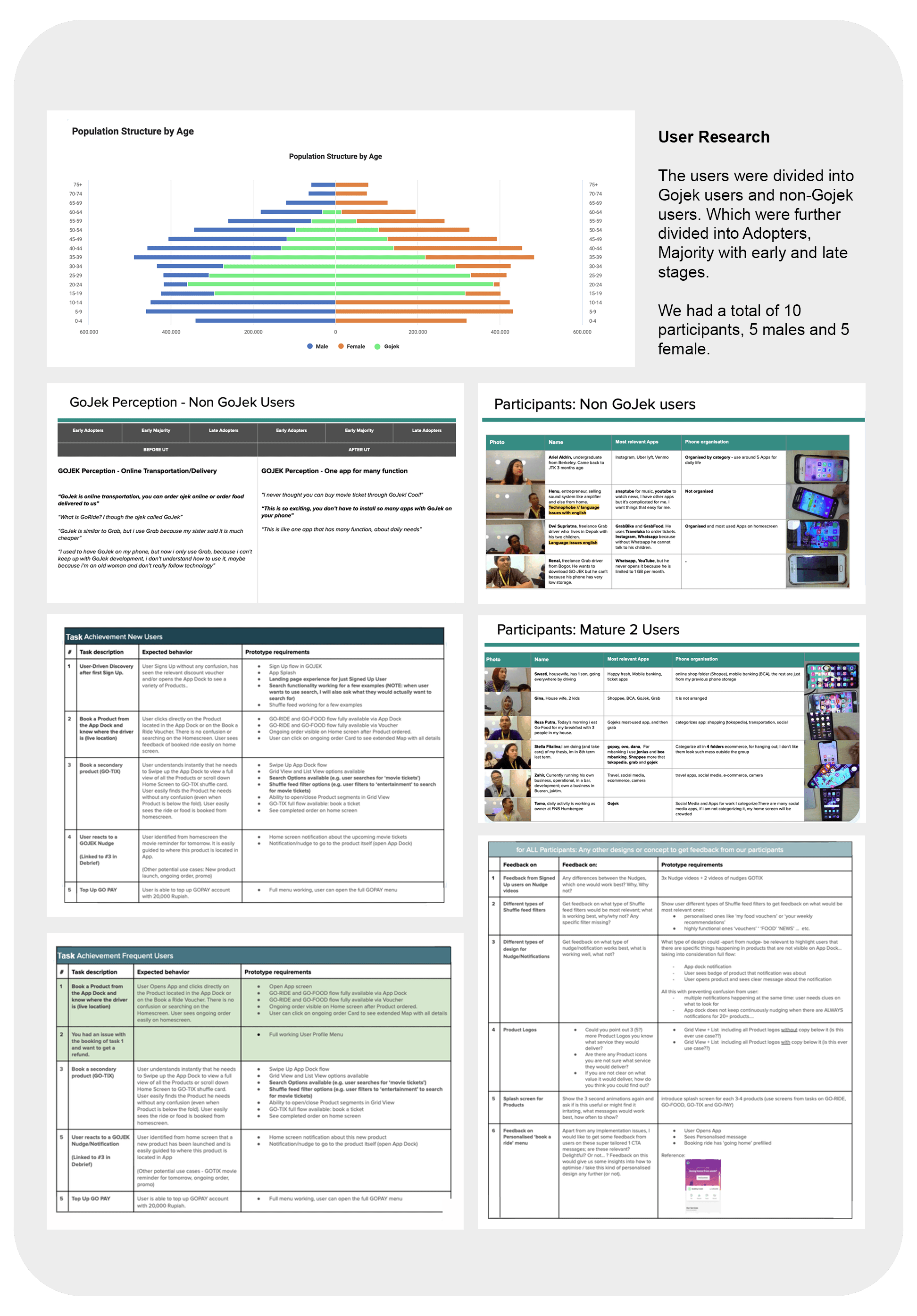
Involved in experimenting with the user experience of the home screen, followed with conducting user experience research, and designing solutions for each touchpoint.
Only after receiving positive confirmation from all teams did we move forward.
Problem Statements
App is functional but not delightful.
Difficulty in locating the current order
App navigation was challenging due to n’number of touch points on the home screen.
Users were not able to discover Rewards, discounts coupons and utilising them.
Have a unified communication channel for inbox and C2C chats.
Add personalisation to the product and improve navigation in the app for a better user experience.
Update the app's branding and integrate the Design System to give it a fresh look and feel.
Allocate a dedicated space for marketing within the app.
Business Goals
Increase Golden Triangle Users - i.e. Make users use more the 2 products
Service / Feature discoverability and Increase User Engagement- New service and features to be easily discovered by the users.
Improve Discovery of Rewards - make rewards easily accessible to the users
Critical First Time Experience - bring in better experience from the moment user clicks the app
Make GO-PAY easily accessible.
Design Principles
Usable: Ensure that the product is effective, efficient, and satisfactory for use.
Delight : Increase positive emotional effect of users while interacting with Gojek.
Theme-able: Ensure that the product is theme able and can easily adapt to different geographies.
Tie with Rebrand: Match the visual tone of ‘Solv’
Accessible: Ensure that product is operable by people with a wide range of abilities.
Approach
We needed to run a lot of activities in parallel to be able to define the next homepage and ensure there are no legacy issues by fixing the navigational and hierarchy issues in the current design. We agreed defining the IA would be critical for this. Main activities and collaboration for it were as below:
Strategy
Product
We started with identifying the red flags in the logical pathway for task completion. This was a living doc and something that we feed into...
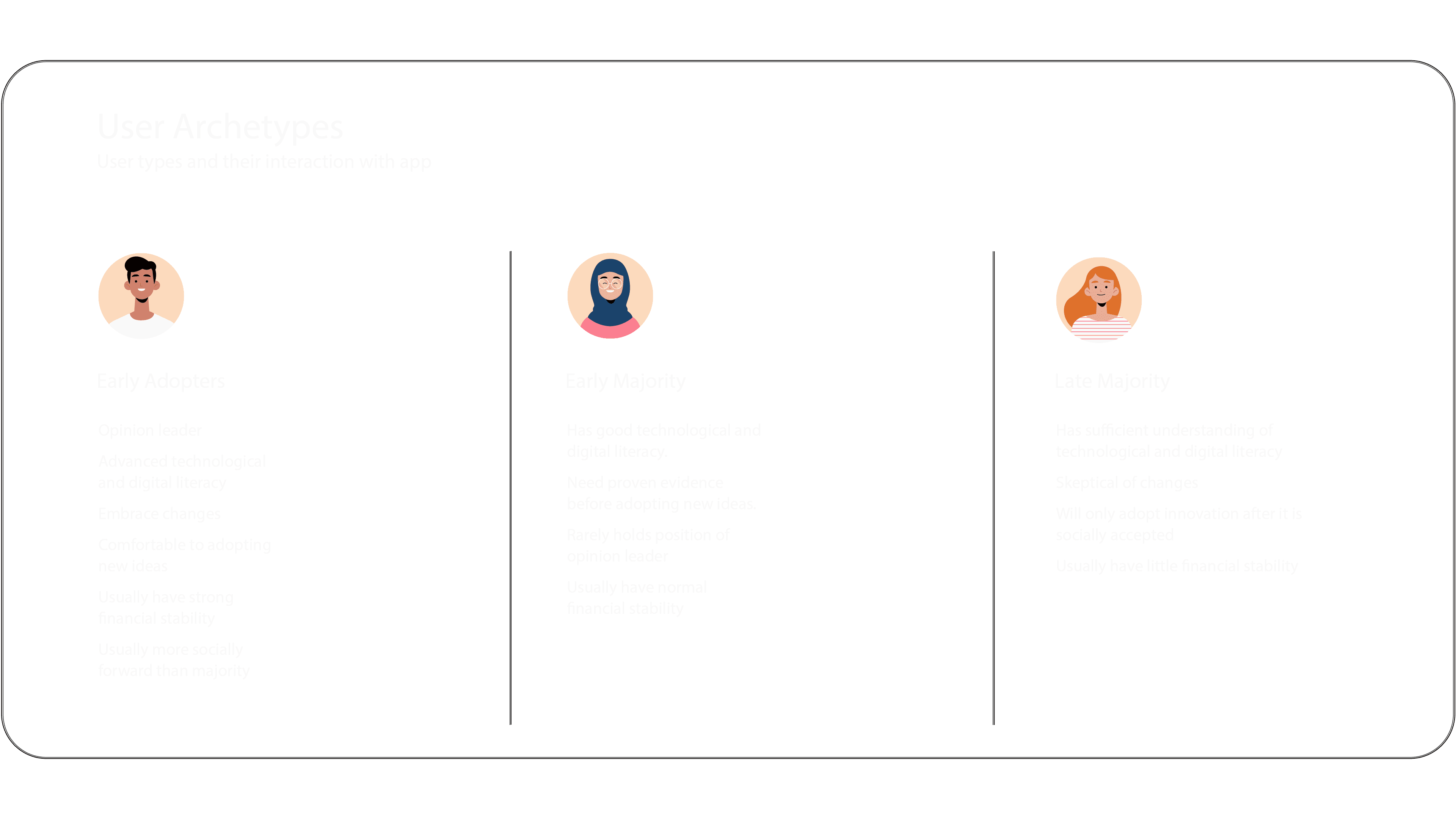
Identifying User archetypes
List Jobs to be done
Verify using Data and research- qualitative and quantitative based on user behaviour and traffic and success metrics
Card sorting exercise with team & users
Tree testing
Concept testing
Propose an IA based on Industry standard principles.
Once the IA was defined we could look at the app navigation and hierarchy of information on homepage.
Navigation
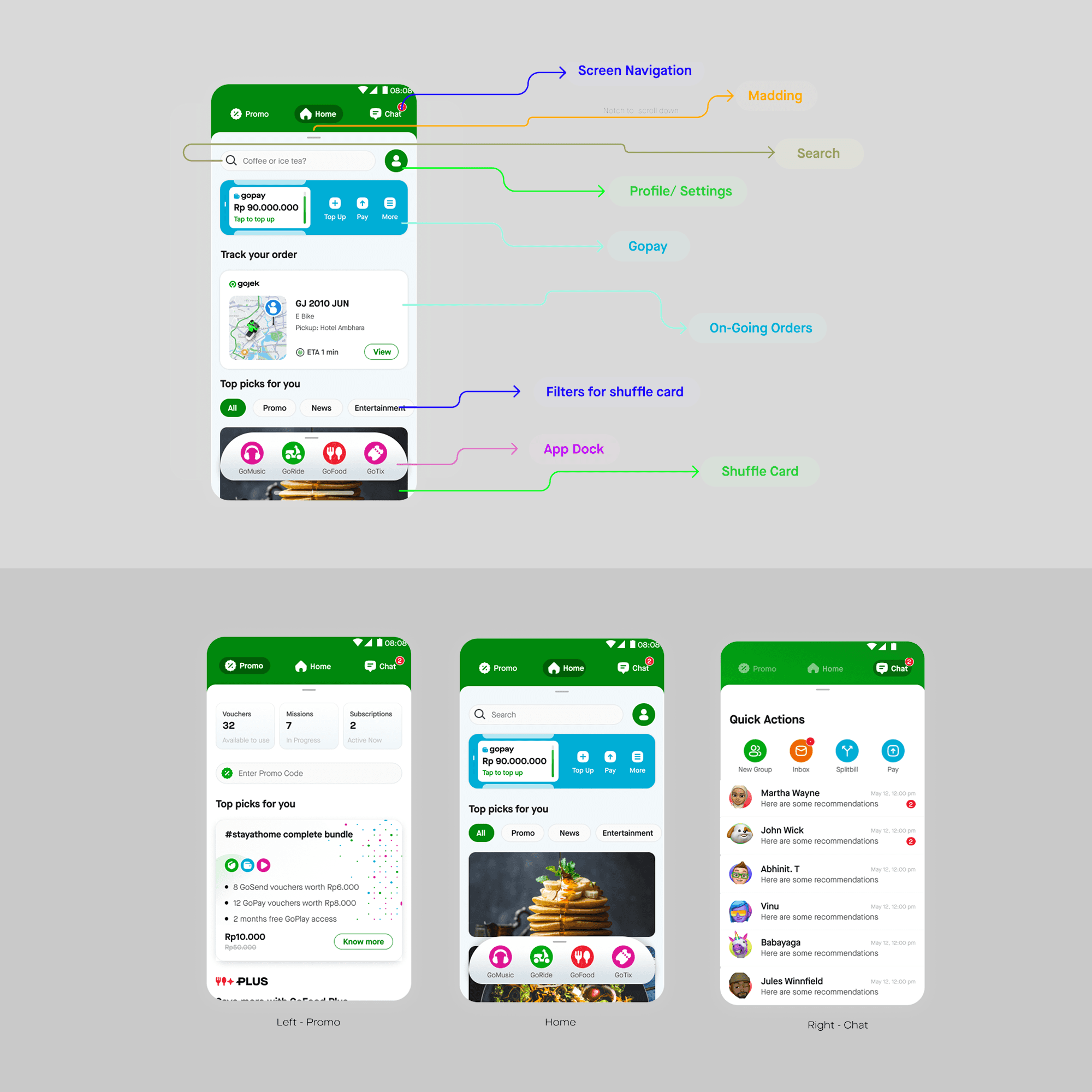
This was crucial for us as we were introducing a new Gesture base approach where users can perform all basic navigation with just one finger. We called it a Thumb-able Design. We defined the screen as per the user needs, use cases and also incorporating business needs.
Defining real estate for each vertical.
Listed out all jobs to be done from the home screen.
As basic flow was finalised at the product section it was easy to place all verticals with the flows already. We needed to add the provided flow with the new navigation.
Propose an IA structure with the new layout.
Test generously to get the navigation right and easy.
Developing the experience firsthand to fine tune the resistance of each screen while swiping and interacting with the pages.
Redflags
The task was to redefine the experience and approach towards the next homepage redesign by addressing the concerns with the current design and also looking to improving the usability of the super app.
We wanted to have a super app experience and bring in personalisation for new users.
By doing this we wanted every aspect of the app to be easily approachable and to bring everything to the face of the app which would make it easy to navigate through the app for existing users as well.
The red flags were initially identified by leadership also from heuristic evaluation and what we heard from customers, but we added to it basis other activities explained in the further sections.
Research
There were 3 main use cases which had been identified for the Gojek Home screen. It’ was important to make users feel successful or experience the core benefit of the Gojek product, within the first 30 seconds, effortlessly, to keep them excited and exploring longer
(source: First Session Funnel behaviour and 500 startups)
Use case 1: Clear Intent
User needs a specific product (e.g. I need a ride now). User can find the needed product with the least amount of steps taken. There is zero friction and no confusion!
Use case 2: User-Driven Discovery
User has to have intent to discover. Gojek explicitly gives users relevant content (App listing, app dock, etc) and users must do their own work to discover.
Use case 3: Gojek-Driven Discovery
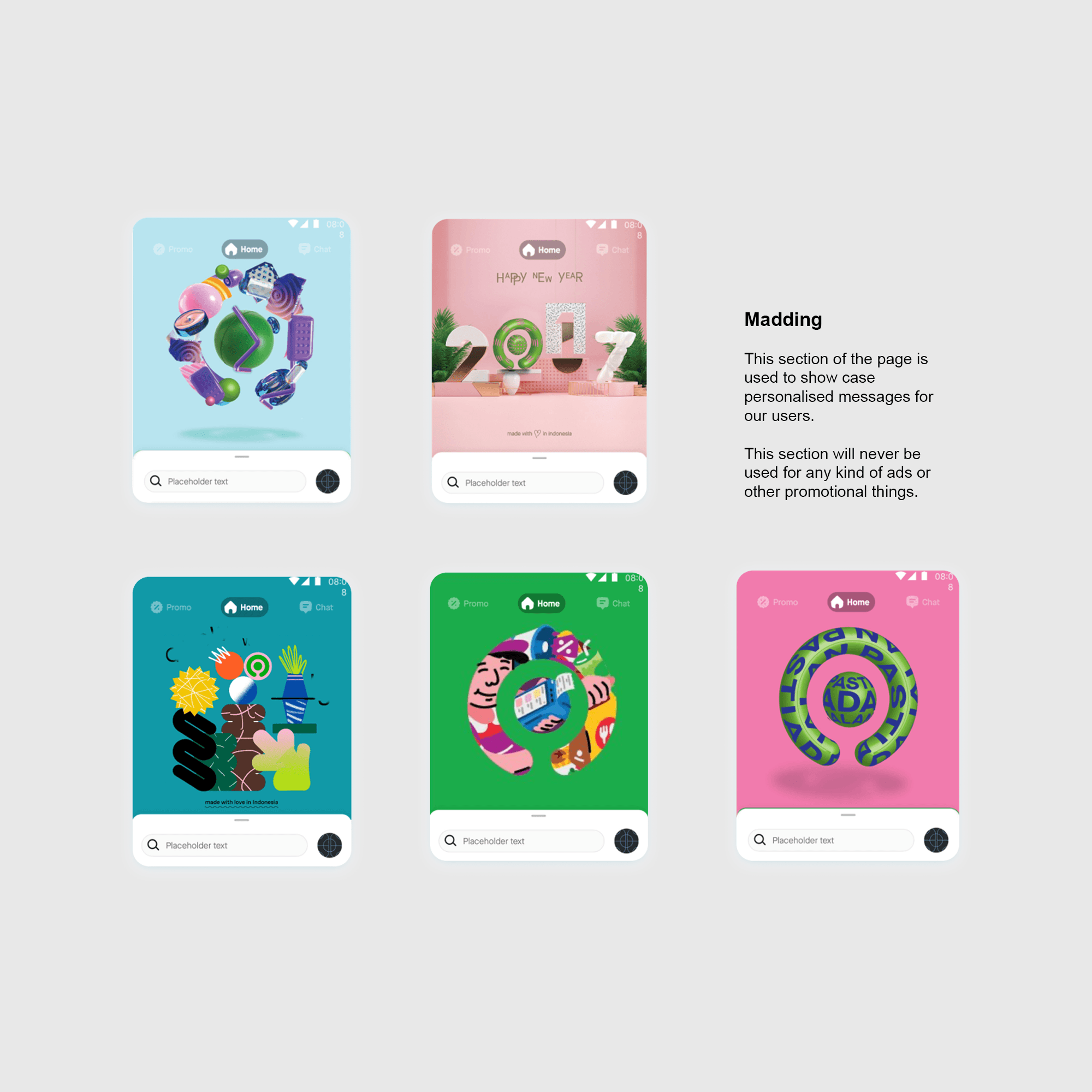
Gojek pushing relevant knowledge and information to users through recommendations and channels like Shuffle, pop ups, notifications etc.
Measure Success
Task success (e.g. completed with ease, completed with difficulty, failed to complete)
Satisfaction (overall feelings and awareness on the GOJEK App before, during and after test)
Problem / issue count (Categorisation of problems observed)
Expected behaviour (Observation of the path a participants takes to accomplish a task, and compares it to a predefined optimal path)
Launch Plan
We proposed all changes with a short term, mid term and long term plan with things that needed change immediately made a part of short term, those that were increments in mid term and final designs in long term.
We rolled each feature with older logos and labelling and then slowly changed it over mid and long term.
Project impact
The program had been live for just 2 months and am sharing below some early trends.
Improved overall home user experience
One of our success metrics was to improve Customer Effort Score and facilitate better app performance. We were able to bring an immediate growth in CES score and the app navigation related tickets reduced by 8%.
Findability and discoverability
We thought of engagement and adoption to be critical metrics to assess improvement in both. The engagement increased with drop off rate reducing by 12% and the adoption increased with no of completed tasks going up by 22% for new users.
Improved time to transact
As we were able to reduce the information overload and reduce cognitive dissonance we were able to bring down the transaction time to an average from 14sec to 3sec
Set ground work for Home 5.0
We didn’t want to add more uneasiness to users by directly offering them home 5.0 while they were still not familiar with 4.0 so we addressed their issues first, resolved IA issues so navigation patterns are understood and then moved forward. Home 5.0 is in progress and we have received good feedback on the same. The team is currently working on that.
Client:
Gojek
Date:
Jan 24, 2020
Category:
Product Design
New Experience to Gojek Home : Making it delightful
Home Screen 4.0 is the landing page on Gojek from where the users journey initiates for all the products and features. We had a company goal from the top leadership to assure delightfulness to the users, which is a great opportunity for designers to show empathy on our users and we left no stones to fulfil the same. This screen as mentioned is start to all the primary flows to the gojek ecosystem and we had got the opportunity to redesign it with the up coming rebrand and launch of our design systems.
My Role and Process
My responsibility as a Lead Principle Designer for this project was to discover a new user experience that allows users to navigate the home section using simple gestures with just their thumb.
Also Incorporating the new design language, Branding and contribute to the new design system being created.
Involved teams from diffrent functions
Launching parallel in countries like Singapore, Vietnam and Thailand with the new design.
8 weeks brainstorming and discussing requirements of the respective functions
Involved in experimenting with the user experience of the home screen, followed with conducting user experience research, and designing solutions for each touchpoint.
Only after receiving positive confirmation from all teams did we move forward.
Problem Statements
App is functional but not delightful.
Difficulty in locating the current order
App navigation was challenging due to n’number of touch points on the home screen.
Users were not able to discover Rewards, discounts coupons and utilising them.
Have a unified communication channel for inbox and C2C chats.
Add personalisation to the product and improve navigation in the app for a better user experience.
Update the app's branding and integrate the Design System to give it a fresh look and feel.
Allocate a dedicated space for marketing within the app.
Business Goals
Increase Golden Triangle Users - i.e. Make users use more the 2 products
Service / Feature discoverability and Increase User Engagement- New service and features to be easily discovered by the users.
Improve Discovery of Rewards - make rewards easily accessible to the users
Critical First Time Experience - bring in better experience from the moment user clicks the app
Make GO-PAY easily accessible.
Design Principles
Usable: Ensure that the product is effective, efficient, and satisfactory for use.
Delight : Increase positive emotional effect of users while interacting with Gojek.
Theme-able: Ensure that the product is theme able and can easily adapt to different geographies.
Tie with Rebrand: Match the visual tone of ‘Solv’
Accessible: Ensure that product is operable by people with a wide range of abilities.
Approach
We needed to run a lot of activities in parallel to be able to define the next homepage and ensure there are no legacy issues by fixing the navigational and hierarchy issues in the current design. We agreed defining the IA would be critical for this. Main activities and collaboration for it were as below:
Strategy
Product
We started with identifying the red flags in the logical pathway for task completion. This was a living doc and something that we feed into...
Identifying User archetypes
List Jobs to be done
Verify using Data and research- qualitative and quantitative based on user behaviour and traffic and success metrics
Card sorting exercise with team & users
Tree testing
Concept testing
Propose an IA based on Industry standard principles.
Once the IA was defined we could look at the app navigation and hierarchy of information on homepage.
Navigation
This was crucial for us as we were introducing a new Gesture base approach where users can perform all basic navigation with just one finger. We called it a Thumb-able Design. We defined the screen as per the user needs, use cases and also incorporating business needs.
Defining real estate for each vertical.
Listed out all jobs to be done from the home screen.
As basic flow was finalised at the product section it was easy to place all verticals with the flows already. We needed to add the provided flow with the new navigation.
Propose an IA structure with the new layout.
Test generously to get the navigation right and easy.
Developing the experience firsthand to fine tune the resistance of each screen while swiping and interacting with the pages.
Redflags
The task was to redefine the experience and approach towards the next homepage redesign by addressing the concerns with the current design and also looking to improving the usability of the super app.
We wanted to have a super app experience and bring in personalisation for new users.
By doing this we wanted every aspect of the app to be easily approachable and to bring everything to the face of the app which would make it easy to navigate through the app for existing users as well.
The red flags were initially identified by leadership also from heuristic evaluation and what we heard from customers, but we added to it basis other activities explained in the further sections.
Research
There were 3 main use cases which had been identified for the Gojek Home screen. It’ was important to make users feel successful or experience the core benefit of the Gojek product, within the first 30 seconds, effortlessly, to keep them excited and exploring longer
(source: First Session Funnel behaviour and 500 startups)
Use case 1: Clear Intent
User needs a specific product (e.g. I need a ride now). User can find the needed product with the least amount of steps taken. There is zero friction and no confusion!
Use case 2: User-Driven Discovery
User has to have intent to discover. Gojek explicitly gives users relevant content (App listing, app dock, etc) and users must do their own work to discover.
Use case 3: Gojek-Driven Discovery
Gojek pushing relevant knowledge and information to users through recommendations and channels like Shuffle, pop ups, notifications etc.
Measure Success
Task success (e.g. completed with ease, completed with difficulty, failed to complete)
Satisfaction (overall feelings and awareness on the GOJEK App before, during and after test)
Problem / issue count (Categorisation of problems observed)
Expected behaviour (Observation of the path a participants takes to accomplish a task, and compares it to a predefined optimal path)
Launch Plan
We proposed all changes with a short term, mid term and long term plan with things that needed change immediately made a part of short term, those that were increments in mid term and final designs in long term.
We rolled each feature with older logos and labelling and then slowly changed it over mid and long term.
Project impact
The program had been live for just 2 months and am sharing below some early trends.
Improved overall home user experience
One of our success metrics was to improve Customer Effort Score and facilitate better app performance. We were able to bring an immediate growth in CES score and the app navigation related tickets reduced by 8%.
Findability and discoverability
We thought of engagement and adoption to be critical metrics to assess improvement in both. The engagement increased with drop off rate reducing by 12% and the adoption increased with no of completed tasks going up by 22% for new users.
Improved time to transact
As we were able to reduce the information overload and reduce cognitive dissonance we were able to bring down the transaction time to an average from 14sec to 3sec
Set ground work for Home 5.0
We didn’t want to add more uneasiness to users by directly offering them home 5.0 while they were still not familiar with 4.0 so we addressed their issues first, resolved IA issues so navigation patterns are understood and then moved forward. Home 5.0 is in progress and we have received good feedback on the same. The team is currently working on that.